Plot the histogram or density of the Conditional Average Treatment Effect
Source:R/plot_ATE.R
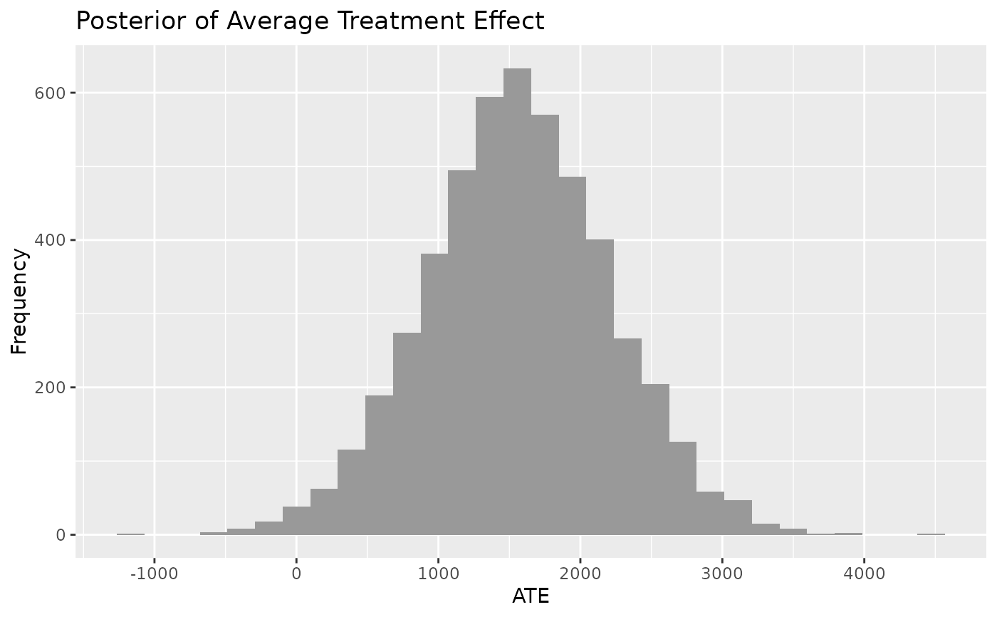
plot_CATE.RdPlot the conditional average treatment effect (CATE) of a 'bartCause' model. The conditional average treatment effect is derived from taking the difference between predictions for each individual under the control condition and under the treatment condition averaged over the population. Means of the CATE distribution will resemble SATE and PATE but the CATE distribution accounts for more uncertainty than SATE and less uncertainty than PATE.
Usage
plot_CATE(
  .model,
  type = c("histogram", "density"),
  ci_80 = FALSE,
  ci_95 = FALSE,
  reference = NULL,
  .mean = FALSE,
  .median = FALSE
)
Arguments
- .model
a model produced by `bartCause::bartc()`
- type
histogram or density
- ci_80
TRUE/FALSE. Show the 80% credible interval?
- ci_95
TRUE/FALSE. Show the 95% credible interval?
- reference
numeric. Show a vertical reference line at this value
- .mean
TRUE/FALSE. Show the mean reference line
- .median
TRUE/FALSE. Show the median reference line
Examples
# \donttest{
data(lalonde)
confounders <- c('age', 'educ', 'black', 'hisp', 'married', 'nodegr')
model_results <- bartCause::bartc(
 response = lalonde[['re78']],
 treatment = lalonde[['treat']],
 confounders = as.matrix(lalonde[, confounders]),
 estimand = 'ate',
 commonSup.rule = 'none'
)
#> fitting treatment model via method 'bart'
#> fitting response model via method 'bart'
plot_CATE(model_results)
#> Warning: Ignoring unknown parameters: `ccolour`
#> `stat_bin()` using `bins = 30`. Pick better value with `binwidth`.

# }
# }