plotBart uses ggplot2 to
construct plots. These functions return ggplot objects that can be
manipulated similar to standard ggplot2::ggplot() calls.
Plot titles, subtitles, labels, captions, and themes can be easily
customized using ggplot syntax.
library(plotBart)
data(lalonde)
confounders <- c('age', 'educ', 'black', 'hisp', 'married', 'nodegr')

# plot balance across treatment and control groups
p <- plot_balance(.data = lalonde,
                  treatment = 'treat',
                  confounders = confounders,
                  compare = 'means',
                  estimand = 'ATE')
p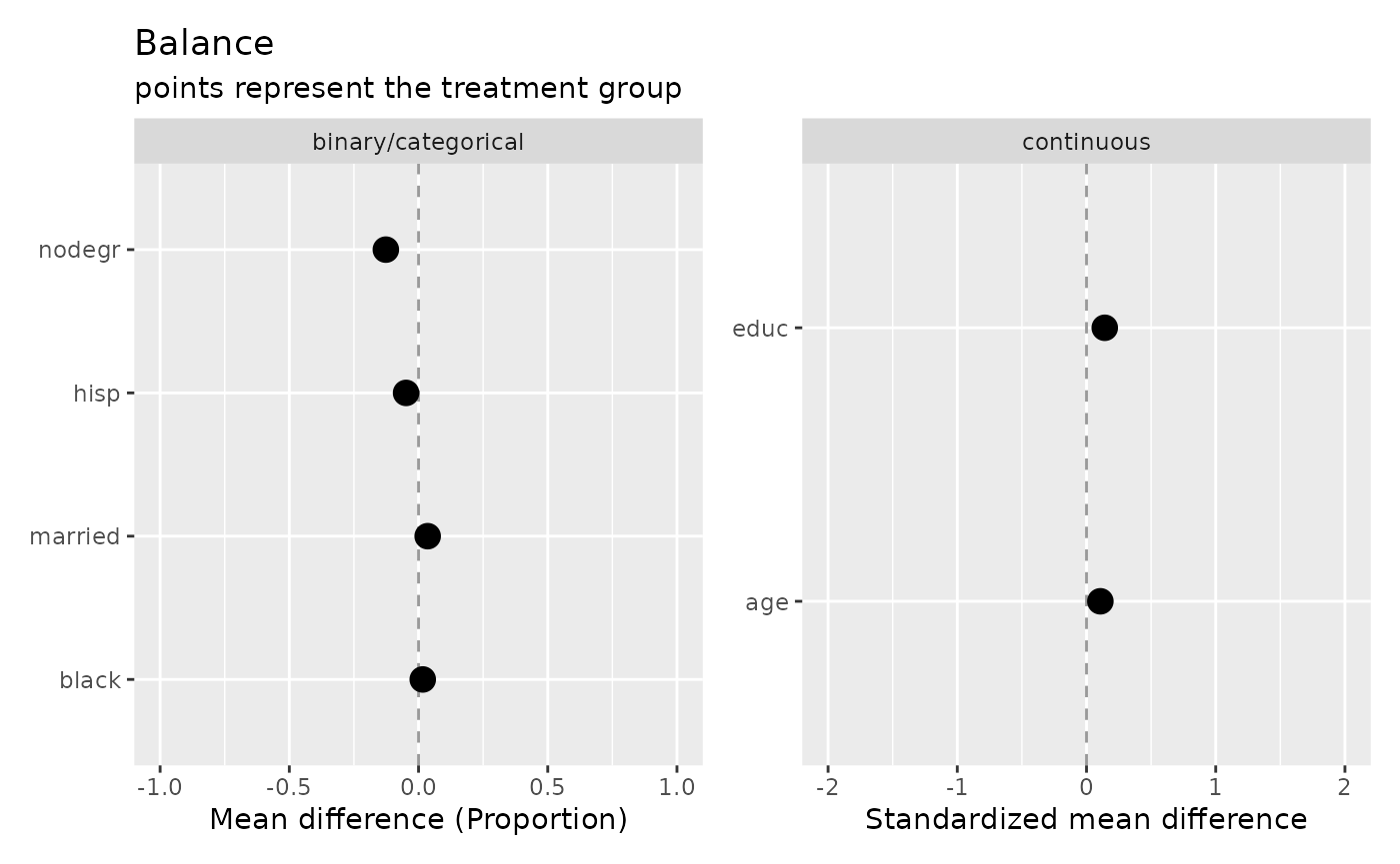
Modify the plot labels:
p +
  labs(title = 'My comments on the results',
       subtitle = NULL,
       caption = 'December 2021',
       x = 'Mean diff b/t treatment and control')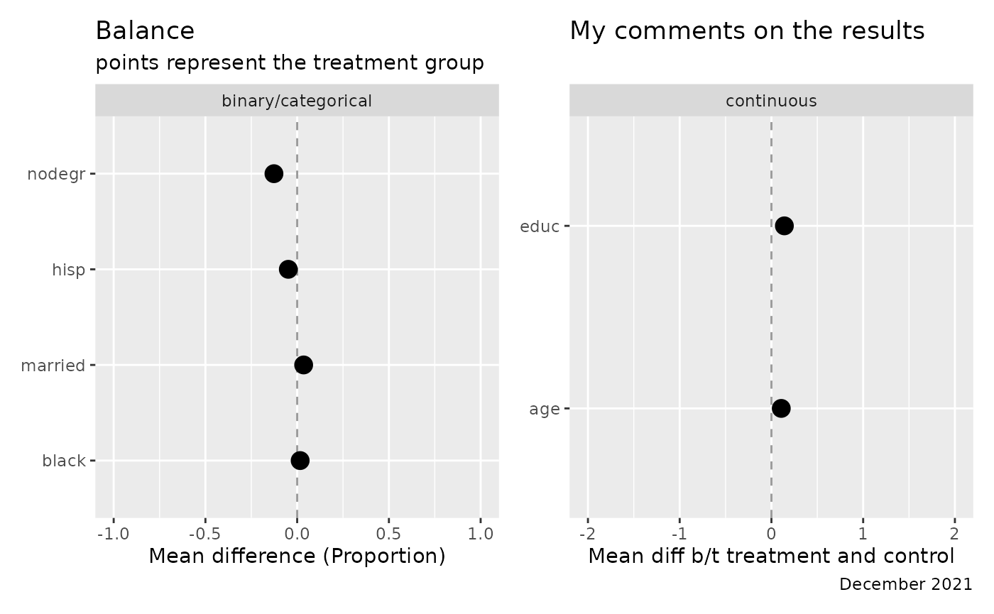
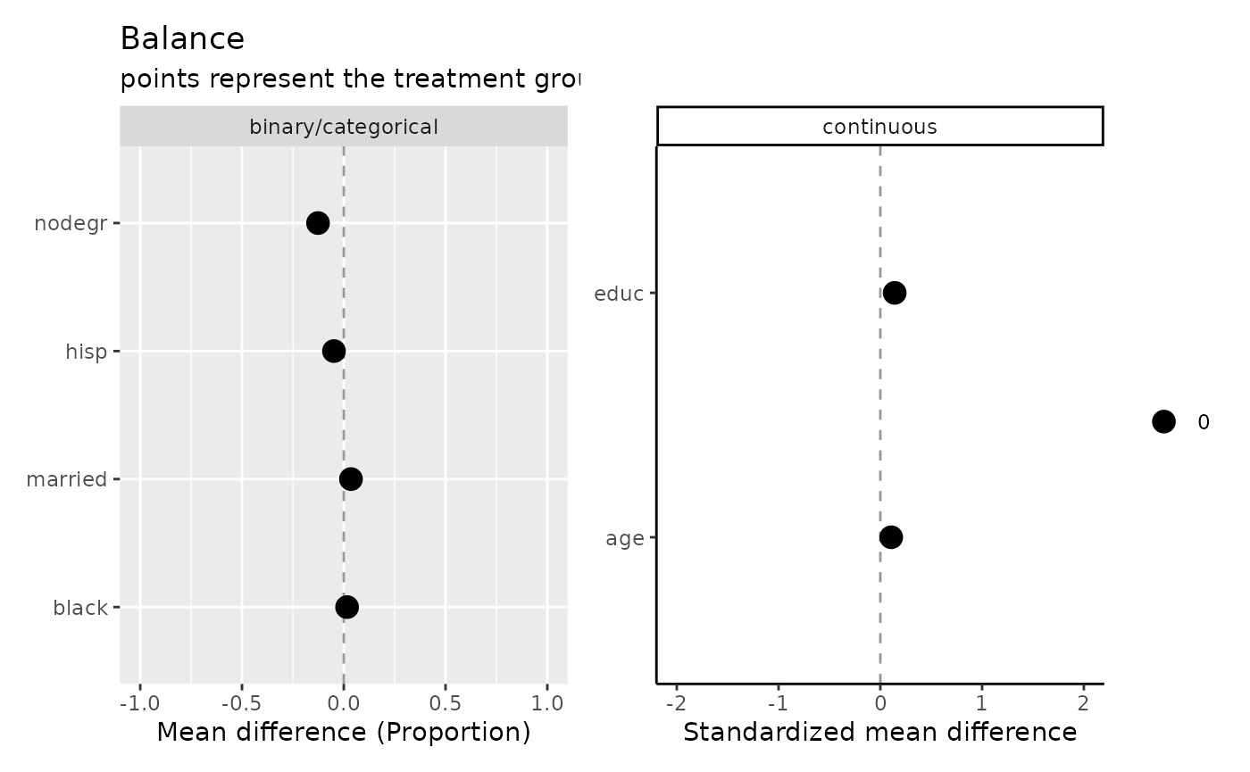
Extract data to reconstruct the plot:
p$data
#>   name variance_FALSE variance_TRUE mean_FALSE mean_TRUE       type     means
#> 1  age      49.811761     51.194301   25.05385  25.81622 continuous 0.1072771
#> 2 educ       2.606044      4.042714   10.08846  10.34595 continuous 0.1412198
#>   variance     order flag_means flag_variance flag
#> 1 1.013783 0.1072771          0             0    0
#> 2 1.245506 0.1412198          0             0    0