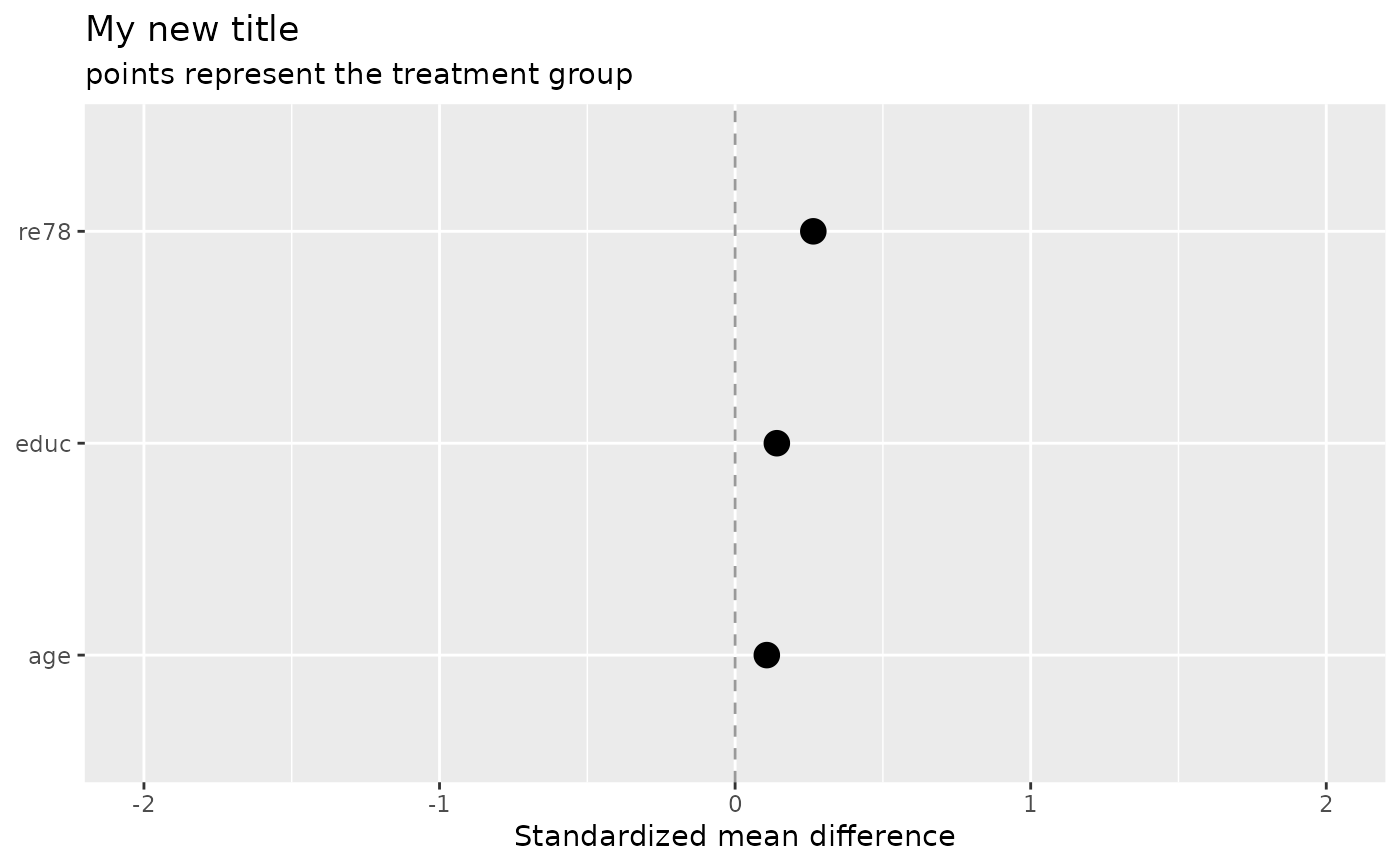
Visualize balance of variables between treatment and control groups. Balance plot reflects balance in standardized units.
Arguments
- .data
dataframe
- treatment
the column denoted treatment. Must be binary.
- confounders
character list of column names denoting the X columns of interest
- compare
character of either means or variance denotes what to compare balance on
- estimand
character of either ATE, ATT or ATC the causal estimand you are making inferences about
- limit_continuous
integer that can be used to limit the plot to only show the limit_continuous most imbalanced variables
- limit_catagorical
integer that can be used to limit the plot to only show the limit_categorical most imbalanced variables