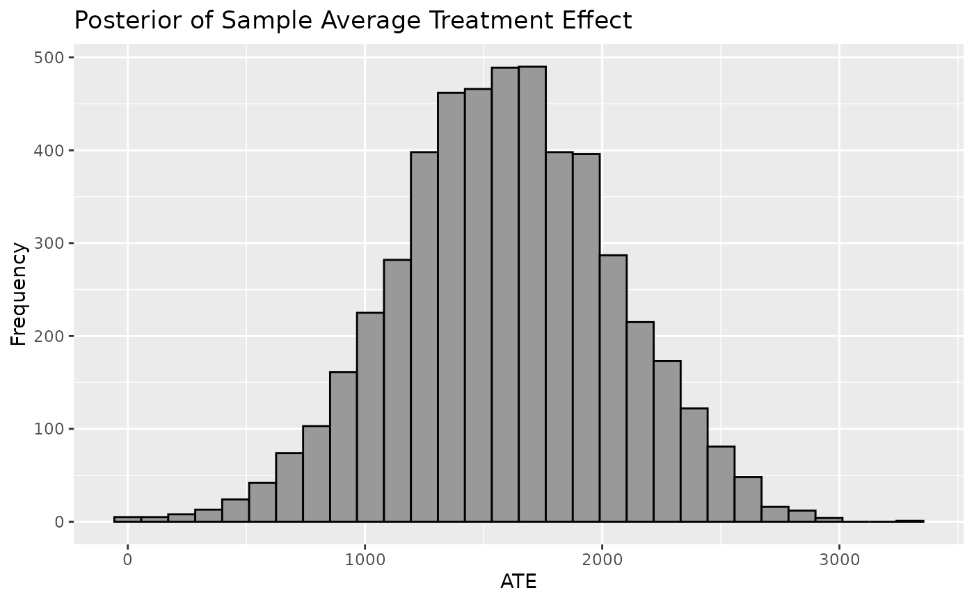
Plot shows the Population Average Treatment Effect which is derived from the posterior predictive distribution of the difference between \(y | z=1, X\) and \(y | z=0, X\). Mean of PATE will resemble CATE and SATE but PATE will account for more uncertainty and is recommended for informing inferences on the average treatment effect.
Usage
plot_PATE(
  .model,
  type = c("histogram", "density"),
  ci_80 = FALSE,
  ci_95 = FALSE,
  reference = NULL,
  .mean = FALSE,
  .median = FALSE
)
Arguments
- .model
a model produced by `bartCause::bartc()`
- type
histogram or density
- ci_80
TRUE/FALSE. Show the 80% credible interval?
- ci_95
TRUE/FALSE. Show the 95% credible interval?
- reference
numeric. Show a vertical reference line at this value
- .mean
TRUE/FALSE. Show the mean reference line
- .median
TRUE/FALSE. Show the median reference line
Examples
# \donttest{
data(lalonde)
confounders <- c('age', 'educ', 'black', 'hisp', 'married', 'nodegr')
model_results <- bartCause::bartc(
 response = lalonde[['re78']],
 treatment = lalonde[['treat']],
 confounders = as.matrix(lalonde[, confounders]),
 estimand = 'ate',
 commonSup.rule = 'none'
)
#> fitting treatment model via method 'bart'
#> fitting response model via method 'bart'
plot_PATE(model_results)
#> `stat_bin()` using `bins = 30`. Pick better value with `binwidth`.

# }
# }