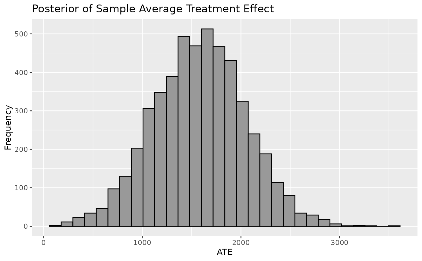
Plot a histogram or density of the Sample Average Treatment Effect (SATE). The Sample Average Treatment Effect is derived from taking the difference of each individual's observed outcome and a predicted counterfactual outcome from a BART model averaged over the population. The mean of SATE will resemble means of CATE and PATE but will account for the least uncertainty.
Arguments
- .model
a model produced by `bartCause::bartc()`
- type
histogram or density
- ci_80
TRUE/FALSE. Show the 80% credible interval?
- ci_95
TRUE/FALSE. Show the 95% credible interval?
- reference
numeric. Show a vertical reference line at this x-axis value
- .mean
TRUE/FALSE. Show the mean reference line
- .median
TRUE/FALSE. Show the median reference line
- check_overlap
TRUE/FALSE. Check if any overlap rules are applicable
- overlap_rule
enter overlap rules to view how different bartCause removal rules would have influenced results. Only applicable if check_overlap is TRUE.
Examples
# \donttest{
data(lalonde)
confounders <- c('age', 'educ', 'black', 'hisp', 'married', 'nodegr')
model_results <- bartCause::bartc(
 response = lalonde[['re78']],
 treatment = lalonde[['treat']],
 confounders = as.matrix(lalonde[, confounders]),
 estimand = 'ate',
 commonSup.rule = 'none'
)
#> fitting treatment model via method 'bart'
#> fitting response model via method 'bart'
plot_SATE(model_results)
#> `stat_bin()` using `bins = 30`. Pick better value with `binwidth`.

# }
# }