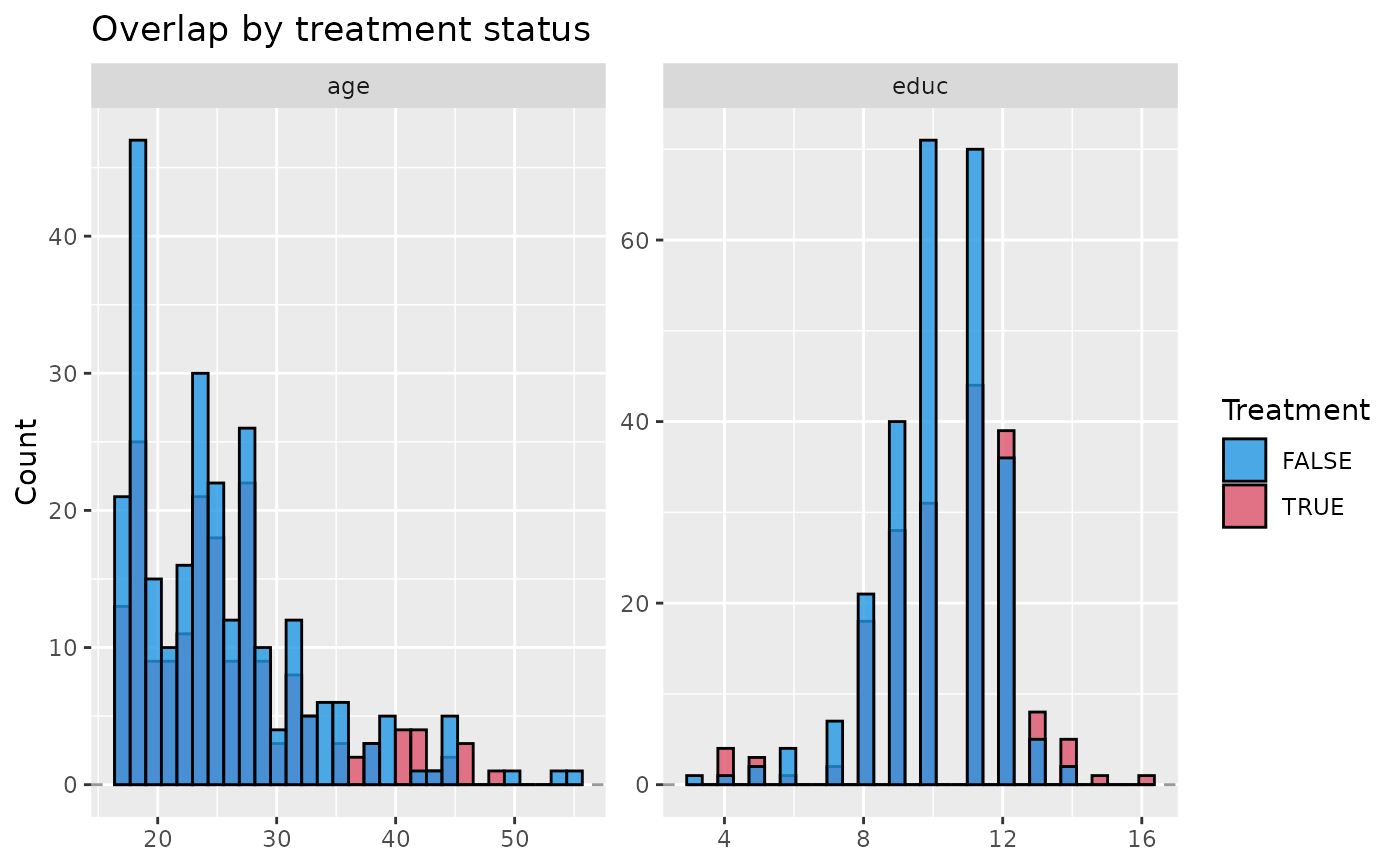
Plot histograms showing the overlap between variables by treatment status.
Usage
plot_overlap_vars(
  .data,
  treatment,
  confounders,
  plot_type = c("histogram", "density"),
  min_x = NULL,
  max_x = NULL
)
Arguments
- .data
dataframe
- treatment
character. Name of the treatment column within .data
- confounders
character list of column names denoting confounders within .data
- plot_type
the plot type, one of c('histogram', 'density'). Defaults to 'histogram'
- min_x
numeric value specifying the minimum value to be shown on the x axis
- max_x
numeric value specifying the maximum value to be shown on the x axis